PrerequisitesIf you want to follow along here you can grab the font from the link in the ‘More Information’ section of this post. If you want to use a different font to experiment, you’ll need one with a few different palettes - this one we’re using has an astounding 11 different palettes. I’ve found that there isn’t a whole lot of these types of variable fonts to choose from without going onto the range of ‘quirky’ ones.
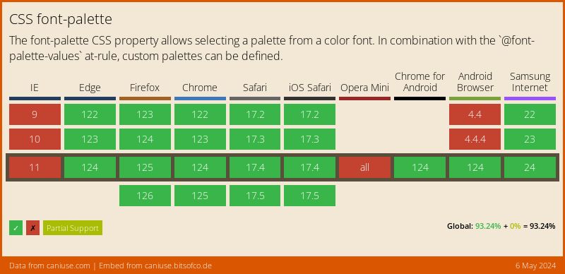
I went to put a warning “Btw, this might only be supported if you only use XYZ browser”, but it turns out that’s not the case, check this support out! Looking at you again, IE.
Ok, so we’ve got our variable font in our project, and it looks cool, but it doesn’t look 100%. The font style meets your expectations, but the colors…m’eh. Kind of works, but could be improved to go along with the color scheme being used. Here’s our basic class .variable-heading that these examples are going to be worked around. Here’s what it looks like.
.variable-heading {
  font-size: 6rem;
  font-family: 'Rocher';
  letter-spacing: -3.5px;
  line-height: 1;
}
This has no variation settings or palette change
There’s nothing specific to variable fonts being used here, but it gives us a good base to work on top of. Noting the description from Can I Use, the font-palette property has to be used alongside @font-palette-values, so we’re going to make sure we don’t leave this out.
We can define a value for font-palette in two ways; a font-defined palette or a user-defined palette. The font-defined palette is the default one supplied by the font - font-palette: normal, whereas the user-defined palette is one supplied seperately by the user in the stylesheet - font-palette: myPalette.
On top of our variable-heading class, we’re going to add the font-palette property with a user-defined palette value of --monochrome. We’re going to knock away the shadow and the bevel too slightly with font-variation-settings: "SHDW" 0, "BVEL" 50 - this isn’t anything to do with palette changing, it just makes it look a bit more pretty. We’ve got our --monochrome palette value, but nothing to link it too, yet. Remember @font-palette-values? That’s where this creeps in. We’ll set this at-rule (when something starts with an ‘@’ e.g. @media) up above our variable-heading class, calling it @font-palette-values --monochrome. Into this rule we’ll have to set the font-family that we set in variable-heading, and also a new property base-palette. The value of this new property is dependant on how many palettes exist in the font, we’ve got 11 in ‘Rocher’, I’m going to set this value as ‘9’. Let’s take a look at what our font looks like now.
+ @font-palette-values --monochrome {
+   font-family: Rocher;
+   base-palette: 9;
+ }

.variable-heading {
  font-size: 5rem;
  letter-spacing: -3.5px;
+ font-variation-settings: "SHDW" 0, "BVEL" 50;
+ font-palette: --monochrome;
}
This has a palette change
We can also change palette styles on interaction with the text, like this!
@font-palette-values --mint {
  font-family: Rocher;
  base-palette: 7;
}

.variable-heading:hover {
  font-palette: --mint;
}
This has a different palette on hover
I guess there’s a downside to using a number to reference a color palette as we’ve been doing. I had wishful thinking that you could pass in a custom property to the @font-palette-values rule, so you could give it some kind of useful name, like this;
  :root {
    --mint-palette: 7;
  }

  @font-palette-values --mint {
    font-family: Rocher;
    base-palette: var(--mint-palette);
  }
But nothing, so we’re stuck with the numbers, and needing a reference as to what palette numbers are what colours. Sad times.
So there’s another propery we can use instead of font-palette, which is called override-colors. This gives you access to the individual colors used in each palette…
Let’s imagine that none of the preset color palettes were what you were looking for, and you want to impose your own colors on it instead (let’s face it, the mint color I tested on the hover state didn’t exactly fit my super cool monochrome aesthetic). Let’s see what we can do here.
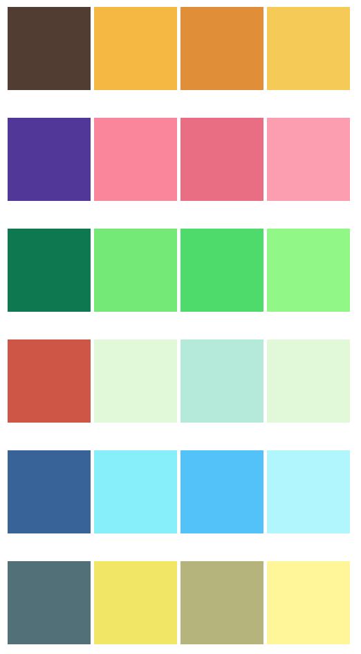
So there’s another propery we can use instead of font-palette, which is called override-colors. This gives you access to the individual colors used in each palette, and the ability to override those colors seperately by using the color values alongside the color number. It can be quite difficult to establish which color number is equal to a specific color on the font, so it does take a bit of guesswork to start with. There’s also the added complication that each font could have a different amount of palettes, with a different amount of colors in them. Our font for this ‘Rocher’, has 11 palettes, with 4 colors in each.

A segment of Rocher's color palette choices.
So, there’s 4 colors available to override on our custom palette. For the default palette, we’ve got; the yellow, the slightly orange tint on the letters, the border around each letter, and the shadow. Playing around with it leaves us with a custom theme, as shown below.
@font-palette-values --coloredTheme {
  font-family: Rocher;
  override-colors:
    0 #e63946,
    1 #010f0a;
}

.variable-heading {
  font-size: 5rem;
  font-family: 'Rocher';
  letter-spacing: -3.5px;
  font-variation-settings: "SHDW" 0, "BVEL" 50;
- font-palette: --monochrome;
+ font-palette: --coloredTheme;
}
This overrides the original palette
Kind of fits my current color scheme, but really needs to be a bit more plain - let’s be honest, the above is actually pretty unsightly. Stripping out the color from everything apart from the first color option which I’m setting as the black from my theme.
This overrides the original palette
I wished for gradients, but alas, no dice.
To sum up, these are things you need to do to control a palette;
- use a variable font that is either a COLRv0 or a COLRv1 typeface
- use a
@font-palette-valuesat-rule to define what you want to call the palette e.g.--coloredPalette - in that, set the
font-familyand thebase-palettenumber - if you want to override the palette, use the
override-colorsproperty to define different colours
Despite a good bit of support, I probably wouldn’t be using this on a client build as I think it’s got some limitations and is slightly difficult to predict.
At the very least, it’s an interesting experiment to play around with. Despite a good bit of support, I probably wouldn’t be using this on a client build as I think it’s got some limitations and is slightly difficult to predict. Some things also didn’t seem to work for me that works with normal fonts, like transitioning between color palette changes on hover, or passing custom properties. So it’s a bit of a trade-off between expectations - you can do some fancy things with colors, but in turn you lose some pretty standard things.
Bet the word palette is starting to look strange now, right?
Fin.
