There's some CSS properties used in this demo and in the featured Codepen that are experimental technologies - check your browser support for animation-timeline and view-timeline-name before venturing further and thinking I've broken something. I'm in no means an expert at this here, but I think I got it right!
I was interested in picking up some new CSS tricks, and there’s been a lot of talk recently about scroll driven animations. Feeling inspired during a weekend away, I dug around on Codepen for some and came across this pen from Ryan Mulligan (hexagoncircle).
See the Pen ScrollTrigger - Highlight Text by Ryan Mulligan (@hexagoncircle) on CodePen.
After playing around with it and digging into the source code, pretty instantly found out it was a GSAP demo rather than scroll driven animations. Ah well, it’s still lovely, and this post is in no way assuming that I can do one better. But then I wondered how tricky it would be to take this original demo and refactor it to not depend on the GSAP library anymore, and instead bring in those sweet scroll driven animations that I was so keen to figure out.
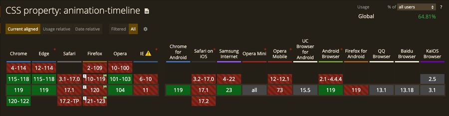
Support for animation-timeline from caniuse as of November, 2023
The original #
Let’s start by breaking down Ryan’s demo a bit. There’s very little functional magic actually in the HTML - although it’s very pretty markup! We’ve got a header element containing options; dark mode & some underlining styles (background, underlined etc). The bulk of the content is in a main element, as expected, with some content wrapped in a mark element with a class of text-highlight. Easy stuff, apart from…what’s a mark element and what’s the point of it semantically?
The
<mark>HTML element represents text which is marked or highlighted for reference or notation purposes due to the marked passage’s relevance in the enclosing context.
So, to rip a use case out of the mdn docs;
“When used in a quotation ([<q>](https://developer.mozilla.org/en-US/docs/Web/HTML/Element/q)) or block quote ([<blockquote>](https://developer.mozilla.org/en-US/docs/Web/HTML/Element/blockquote)), it generally indicates text which is of special interest but is not marked in the original source material, or material which needs special scrutiny even though the original author didn’t think it was of particular importance. Think of this like using a highlighter pen in a book to mark passages that you find of interest.”
Pretty interesting, that’s one for the next project if needs be then.
bulk of the content is in a main element, as expected, with some content wrapped in a mark element with a class of text-highlight. Easy stuff, apart from…what’s a mark element
Outside of the setup, the real meat of the demo comes from the styles for the various animations on scroll. For the purpose of keeping this focused, those styles increase the size of a background color across the element, that being setup as a pseudo-underline rather than using ‘text-decoration: underline’. The dropdown values are used as part of an attribute on the body element, which allows us to style it like this;
:root {
  --bg-color-highlight: hsl(60, 90%, 50%);
}

.dark-mode {
  --bg-color-highlight: hsl(238, 70%, 40%);
}

[data-highlight="background"] & {
  background-image: linear-gradient(
    var(--bg-color-highlight),
    var(--bg-color-highlight)
  );
}

[data-highlight="half"] & {
  --line-size: 0.5em;
  background-image: linear-gradient(
    transparent calc(100% - var(--line-size)),
    var(--bg-color-highlight) var(--line-size)
  );
}

[data-highlight="underline"] & {
  --line-size: 0.15em;
  background-image: linear-gradient(
    transparent calc(100% - var(--line-size)),
    var(--color-text) var(--line-size)
  );
}
On the Javascript side, we’ve got the event listeners for the dropdown change and the dark-mode. Excluding them, we’re left with this chunk of GSAP.
gsap.registerPlugin(ScrollTrigger);

gsap.utils.toArray(".text-highlight").forEach((highlight) => {
  ScrollTrigger.create({
    trigger: highlight,
    start: "-100px center",
    onEnter: () => highlight.classList.add("active")
  });
});
To my understanding, this block does this;
- Registers the GSAP ScrollTrigger plugin
- Uses GSAP’s
toArrayfunction, to create an array of elements that has thetext-highlightclass on them - On each item in the array, a
ScrollTriggerthat;- Uses the element as the trigger here, so each element will have its animation triggered independently from each other.
- Starts the animation when it’s -100px from the center of the viewport.
- Has a callback function
onEnterthat adds an active class to that specific element.
So effectively, you scroll and as each mark element gets just 🤏 beyond the center of the viewport, the active class gets applied and BAM that sweet animation goes off. Nice! This is a real cool demo and looks ace. So let’s rip it down and rebuild it.
The rework #
The most notable thing here is that by using CSS scroll driven animations you can ditch a whole bunch of JS. That GSAP library? Out the window, saving KBs in the process. Let’s keep the dark mode/css options though in our rebuild.
const highlight = document.getElementById("highlight-style");
const mode = document.getElementById("mode");

const setHighlightStyle = (value) =>
  document.body.setAttribute("data-highlight", value);

mode.addEventListener("click", (e) =>
  document.body.classList.toggle("dark-mode")
);

highlight.addEventListener("change", (e) => setHighlightStyle(e.target.value));

setHighlightStyle(highlight.value);
For the HTML nothing needs to change here for this, which is great. Thanks Ryan!
The CSS - given how we’re relying on it more now without the Javascript providing the animations - needs some tweaking. To the mark element that has the text-highlight class, we can add this:
@keyframes highlight {
  to {
    color: var(--color-text-highlight);
    background-size: 100% 100%;
  }
}

@supports (animation-range: cover) {
  .text-highlight {
    animation: highlight linear both;
    animation-timeline: --highlight;
    view-timeline-name: --highlight;
  }
}
and remove this, as we’re no longer adding an active class to any elements:
  &.active {
    color: var(--color-text-highlight);
    background-size: 100% 100%;
  }
90% of the way there I reckon. Let’s take a quick break to explain some of the new CSS properties used above.
We know about the widely used animation property, calling our highlight keyframe animation and setting it with linear easing and both for the fill-mode in order to use the animation properties both forwards and backwards through the keyframe timeline. animation-timeline is a new one though, with it being set to specify the timeline being used to control a CSS animation’s progress. There’s a few different options we can pass in - I would personally refer to MDN for this one. Maybe I’ll dig a bit further into it in a future post. But for the sake of this one, we’re using a single animation named timeline which is set as the name of your timeline animation (as I found, it doesn’t need to necessarily need to be the name of your keyframe animation), and that name prefixed with a --. view-timeline-name is another new one, and is used to define the block in which a timeline passes across. I’ve seen this applied to the parent of an element with a scroll animation on, but in this case we’re defining it and animation-timeline on the same text-highlight class. Again, maybe a deep dive on this one in future, as it was one of the harder parts to comprehend as I wrote this.
by using CSS scroll driven animations you can ditch a whole bunch of JS. That GSAP library? Out the window, saving KBs in the process
So anyway, where were we, so by setting this up this way, this starts the underlining/highlighting animation the moment the element comes into view, which isn’t exactly what we want here. Instead, we need it to trigger -100px from the center or, at the very least, the center itself. Scanning the docs it looks like this we could do this - animation-range: entry 0% entry 100%; - but that seems like it starts it way too soon.
animation-range works in a similar way to how ScrollTrigger has a start property (also, end). Simply put, you can use a single value e.g. cover, contain or two values (either timeline range value or start/end values) e.g. 25% 50%, and is used to set where the timeline will start and end.
A great tool to work with for finding out the correct values here is https://scroll-driven-animations.style, a super helpful visualizer for this. Tinkering around with it, we can change animation-range: entry 0% entry 100%; to animation-range: cover 0% cover 60%, so the highlighting effect starts when it appears in the bottom of the viewport, and finishes when it’s 60% of the way up the screen.
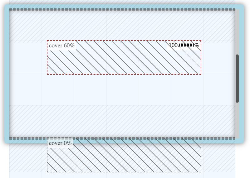
Timeline range for a scroll driven animation
Bingo. That seemed to do the trick pretty well, check out our final demo below. Again, this was very much written while I was learning, so if there’s anything that could be done differently, please let me know!
See the Pen Scroll driven animations - Highlight Text by Dom Jay (@dominickjay217) on CodePen.
Resources #
https://scroll-driven-animations.style/
https://developer.chrome.com/articles/scroll-driven-animations
https://codepen.io/hexagoncircle/pen/gOPMwvd
https://codepen.io/dominickjay217/pen/ExrEdLX
https://developer.mozilla.org/en-US/docs/Web/HTML/Element/mark
https://gsap.com/docs/v3/Plugins/ScrollTrigger/
https://scroll-driven-animations.style
https://ryanmulligan.dev/
https://ryanmulligan.dev/blog/scroll-driven-animations/
https://developer.chrome.com/articles/scroll-driven-animations/
https://developer.mozilla.org/en-US/blog/scroll-progress-animations-in-css/