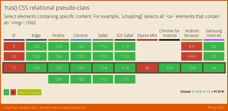
As always, I’m going to start with support for this feature first. For once it’s not just IE being the awkward one, as Firefox doesn’t have support here for it - unless you enable it through the layout.css.has-selector.enabled flag anyway. So if you’re on Firefox and want to see this demo in all its glory, you’ll need this flag enabled or jump onto another browser.
This is now supported in all evergreen browsers, so need for an enabled flag to deal with this support - hooray!
It’s been notoriously difficult to select elements depending on their children
It’s been notoriously difficult to select elements depending on their children (almost as hard as that one level on Crash Bandicoot when you have to ride a tiger down the Great Wall of China, or that level on Max Payne with the crying baby and the blood line path), or siblings that came before it. Super easy to say “let’s make this box red when it is an element following on from an element with a class of outline”.
.outline + .red
But how do we get the 3rd or 4th element away from that outlined box, and make it red? Keep on chaining selectors, like this .outline + .box + .box + .box + .box?
.outline + .box,
.outline + .box + .box + .box + .box {
  background-color: #e63946;
}
Yeah that did it too…but blimey it’s awful isn’t it. We also can’t make the 1st box red if the third box our outlined box, based on the .outline class. There’s no example I can think of that would demonstrate how it doesn’t work - feel free to enlighten me and I’ll add it to this post.
With this complication comes the perfect excuse to take :has() for a spin. We can use it to style our intended box red, when the element after it has the .outline class.
  .box:has( + .outline) {
    background-color: #e63946;
  }
So given that we’ve got access to previous siblings, we’ve got the ability to add states to them. Make that red box turn orange on hover? No problemo.
.box:has( + .outline) {
  background-color: #e63946;
  transition: .3s ease-in-out background-color;
}

/* Apply this when our box is hovered AND
has the outline classed box next to it */
.box:hover:has( + .outline) {
  background-color: #ff5f1f;
}
What if we flipped this, and have the red box go orange when the outlined box is hovered? With :has() it’s easy enough.
.box:has( + .outline) {
  background-color: #e63946;
  transition: .3s ease-in-out background-color;
}

/* Apply this when our box is hovered AND
has the outline classed box next to it */
.box:has( + .outline:hover) {
  background-color: #ff5f1f;
}
See where this is going? Now, we’re going to move our selector from .box to the parent .box-row and use a * to select all the elements in the row, turning them orange.
Then we’ll change it, using :has() on the parent element to check if any of the .outline classes are hovered. Then we can apply a style using :not(), passing the :hover state through. Effectively saying that in this block, any boxes that aren’t hovered, should turn orange when our .outline class is hovered.
#has-example-row-5:has( .outline:hover ) > *:not(:hover) {
  background-color: #ff5f1f;
}
Almost there. Let’s remove .outline from our statement, replacing it with another * selector. So now in this block, any boxes that aren’t hovered, should turn orange when our any of our elements are hovered..outline class
#has-example-row-6:has( *:hover ) > *:not(:hover) {
  background-color: #ff5f1f;
}
We’re so close, but only because the rest is not specifically :has() related. We’re going to use placeskull.com to provide some images in our row blocks. Now we don’t benefit from the background color, let’s use filter: blur(4px) and apply that to the image at the end of our :has() statement. We’ll also need overflow: hidden on the images parent div to prevent the blur from going over the edges - this keeps it nice and contained.
#has-example-row-7 > * {
  transition: .3s ease-in-out all;
}

#has-example-row-7:has( *:hover ) > *:not(:hover) img {
  filter: blur(4px);
}
Lastly, we’ll put a transform: scale() on the image, and also add a background color to the images parent block to be able to cover the whitespace caused by the scale, and voila!
If I end up revisiting this at any point, I’ll probably look at refining the selector as it’s quite long. Maybe that’s the way it has to be to be able to achieve this, but maybe worth the trip. I’m a big fan of this - not only because it’s my own work - and ended up implementing into my Weeknotes posts for my music choices for that week. If you want to see my other work on CodePen, you can follow me here.
